Adsense layout strategy to get more clicks on your ads
The number of clicks you get on your ads greatly depends on the way you layout your ads. Especially AdSense like content related advertisement programs will help you bring more revenues if you place your ads applying more thought.
Most of the people who hosts their blogs on blogspot platform, the prime traffic driver would be Google search and Yahoo Search. Most cases the link referred by a search engine would be pointing to a single blog post or article. And the link referred by most of the site referral or link exchange or blog roll would be to your blog home page. So we have to apply different ads layout strategy for your individual blog post or article page and for your blog home page.
Ads layout for individual blog article page: As the individual blog article page referred by search engines and RSS feed readers will drive users directly to your blog article, is only because of the referred content. In this case it is must that the ads should be adjacent or within the article content.
- You can put your AdSense code soon after the blog article heading and before the starting of the content.
- Also you can put one more AdSense code soon after the content got over.
Preferably, you can use the square ads in above two places. And in order to selectively place your ads in the above two locations, only for individual blog article you have to make use of the
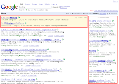
I feel text ads would bring more clicks compared to the image and video ads in this place. See the image below to have a clear picture on ads placement.

Ads layout for home page: You are aware that, link promotions, site referrals and your frequent blog readers would directly come to your home page.
- In order to serve ads for home page its always better to have long horizontal banner ad on top of the blog, this would attract the attention of user when he enters the blog and while closing the page.
- One more point you have to consider is that most of the internet users in this world are right-handed people, so they use to keep their mouse pointer on the right side of the while they are reading the articles. So it is always better to have a large vertical banner on the right side.
This can be selectively achieved by placing your ads between the

Ads layout common to home page and individual page: Try to keep a large vertical banner on the right side and a long horizontal banner on top. Text ads would be preferred if you have more content oriented articles and image and video ads would be preferred where your blog niche is about offers, vehicles, gifts, real estates, FMCG and electronic goods.
If you find any better ad placement strategy, please feel free to share with us.

hi..
I thinks your template very cool
If you can, plz share me this template to my email: taolaga@gmail.com
Big thanks !!!
Very nice article! I’m going to try to work some of these ideas into my site!
http://boatsaroundtown.com
Thanks Guys! Great Idea
Web Design Company
I am new to your blog, nice post. Thanks for the info
Thanks for posting this!